SPLOT! Hah. Blame Brian Lamb for the acronym (despite twitter banter, I like it) for an idea to frame some project ideas for my stint here at Thompson Rivers University. The idea is Simplest Possible Learning Online Tools, things that faculty or designers here could use w/o worry of south of the border servers and not requiring any logins. Something that can be tried and used in the shortest possible time.
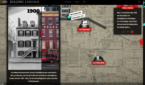
Just to get started, I picked something doable quick. I had seen Tom Woodward experiment with a jQuery widget that allows you to compare two images with a little slider, which I had also seen on the Killing Lincoln National Geographic i-documentary:
That slider on the building allows you to compare photos of the same building taken in 1900 and 2014.
It’s not that hard to do.
It’s not to hard for me to do.
There is an elegant jQuery plugin that does all of the work. And yes, I could write a tutorial on how you have to add the proper links to the jQuery library, the 1 line jQuery setup code, and 4 lines of HTML…
But can it be made simpler? I have an idea, but before doing that, I need to make sure I know how to make it work.
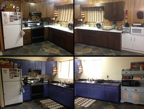
The key is you need images that will match up and therefore be the exact dimensions. To run a test, I found the before/after photos from my summer kitchen remodel

creative commons licensed ( BY-SA ) flickr photo shared by cogdogblog
I cropped out the two on the side, put them in a PhotoShop document, set the opacity on one to be 50% and moved them around to line them up. I then cropped and resized the PSD tp be 800 x 567 px, and exported each layer as a separate jpg.
For first runs, I do this on my MacBookPro in its build in web server directory so I can test locally on my own machine (e.g. at URLs like http://localhost/mygroovysite for a “mygroovysite” folder in the Web Documents folder (you might need to google for how to set this up, I think its a matter of turning on Apache via Terminal).
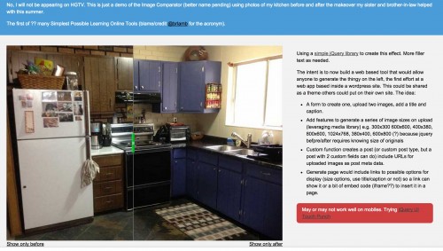
I got it working in the most ugly format possible.
Just because I can, I grabbed a template and CSS from simpliste to put it together at this demo URL http://lab.cogdogblog.com/comparator/.
So how to make this a platform others can use? It does call for some database stuff to store things, and a vehicle for uploading media files. A hitch of using the before/after code is that you need to know the exact dimensions of both images when you write the HTML that makes it work:
[sourcecode lang=”html”]


[/sourcecode]
So either I need to be rigid and demand a fixed file size up front, or try some code to crop and resize images.
It would be nice to let people create a title for it and perhaps a caption.
But I have been interested in a while in seeing what it might take to create small tool sites in WordPress. Sure some colleagues think WP is old hat and we should do doing API shuffling stuff (which I want to learn), but I have reached the point where I can really wield it well (or so I think).
The media uploading (which I figured out how to do on the ds106 Assignment Bank Theme) is slick, but more importantly, I realized I can make it so all uploads generate image sizes in a range of sizes that might match the original image (e.g. small, medium large square images, landscape, and portrait dimensions).
So this is the next step in the plan…
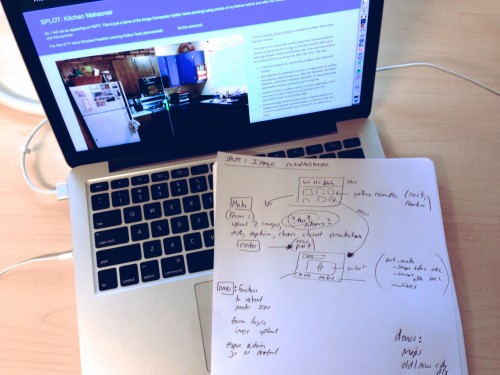
A simple site with a gallery of examples created. A form would let anyone make a new “comparator” (temp name) but uploading 2 images, adding a title, description, maybe add tags, and choose an orientation/size that most closely matches to original.
The form would then create a new post, and custom code in the display would make it display with the working jQuery slider. It would provide a link if someone wants to just refer to it from their own page and (hopefully) an embed code
The most time consuming thing would be coming up with an idea, and finding images that match up well. Possible use cases:
- Before/after historical photos
- Comparing maps from different time periods
- Before/after plastic surgery
- Compare skeleton/xray to animal/human
- ???? (help me blog readers)
This is of course, just a small thing, done in about 2 hours. I have some more floating ideas, and am getting more with each conversation I have here.
Give it a try at http://lab.cogdogblog.com/comparator/ It only sort of works on a mobile, the images are too big (and using responsive scaling breaks the functionality). I added some extra code that suggests it becomes functional in a mobile, but cannot be certain how well it works.
It is so alpha it does not register.
But its just good to get a little code under the fingernails.
UPDATE (within 5 minutes of publishing)
@cogdog this may/may not be of use to you in thinking about your newest tool http://t.co/pbmH0fdPVw
— Tom Woodward (@twoodwar) October 31, 2014
This is such a slicker implementation. Perhaps I can wrap it into the WordPress builder, or abandon ship?


“Splott” is a region of Cardiff… would be worth googling for street signs…
Weller has a camera, put him to work