Heading into a latter (not last, not ending, not over) phase of the You Show, in unit 5 we offer/ask participants to consider how they move a site that looks pretty bloggy into something that might be outwardly facing more like a portfolio or informational web site.
As part of this, I have been offering people individual sessions for a blog “make over” where we talk about what they would like to have the site do, what they have done already, and then work with them on either picking a new theme, tuning up the one they have, and building out structures like pages, categories, menus.
To that end I have been fleshing out the two demo sites in our trubox server that one that shows off the features of themes in a normal blog and a copy of that site in one that lets you see it set up with a static front page.
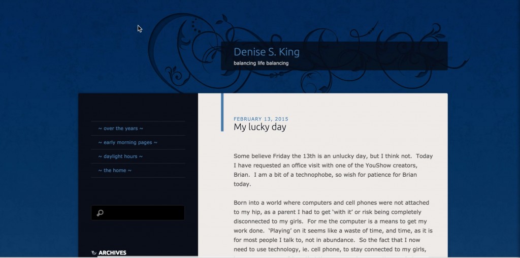
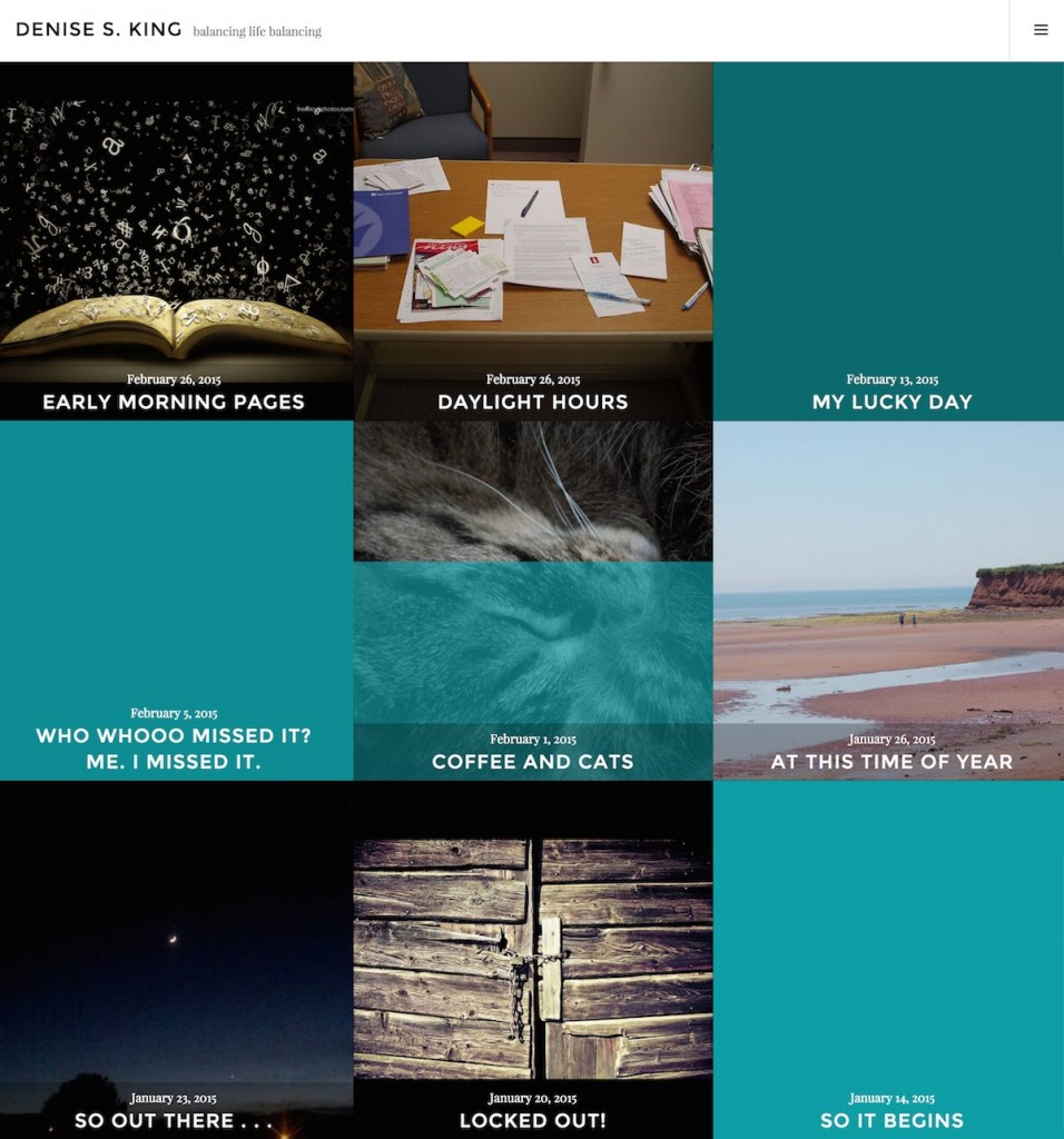
The first volunteer was Denise. Her blog is hosted on WordPress.com and it was a chance to look at the themes I reviewed there (see the second fold out breakdown sheet of unit 5).
Here is the “before” photo
And after, where we applied the Cubic theme found on wordpress.com
No she still has some work to do, adding featured images, but it certainly moves away from the sequential text heavy / side bar on the wide look of a typical blog. I recorded our entire session using QuickTime player in screen recording mode. The video ended up being over 3 Gb, so I compressed it a bit to upload to YuTube; the details of the text on the screen might be blurred, but form an audio and what you see you should be able to follow the (haphazard) steps:
Watch her blog unfold at https://dkat2015.wordpress.com/.
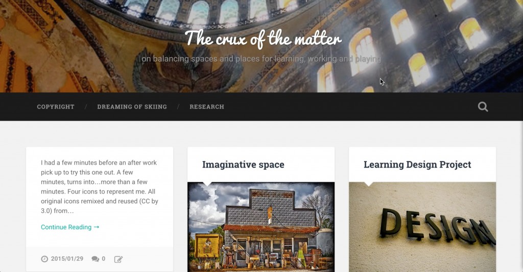
I also did a session with Michelle for her blog, hosted on TRUbox. She has been doing well to explore the Baskerville theme, but she wanted something more in line with the One Pager / Landing Page type design that opens with a big image (she has some incredible photos from her year of international travel).
This is what we started with, which to me already looks good:
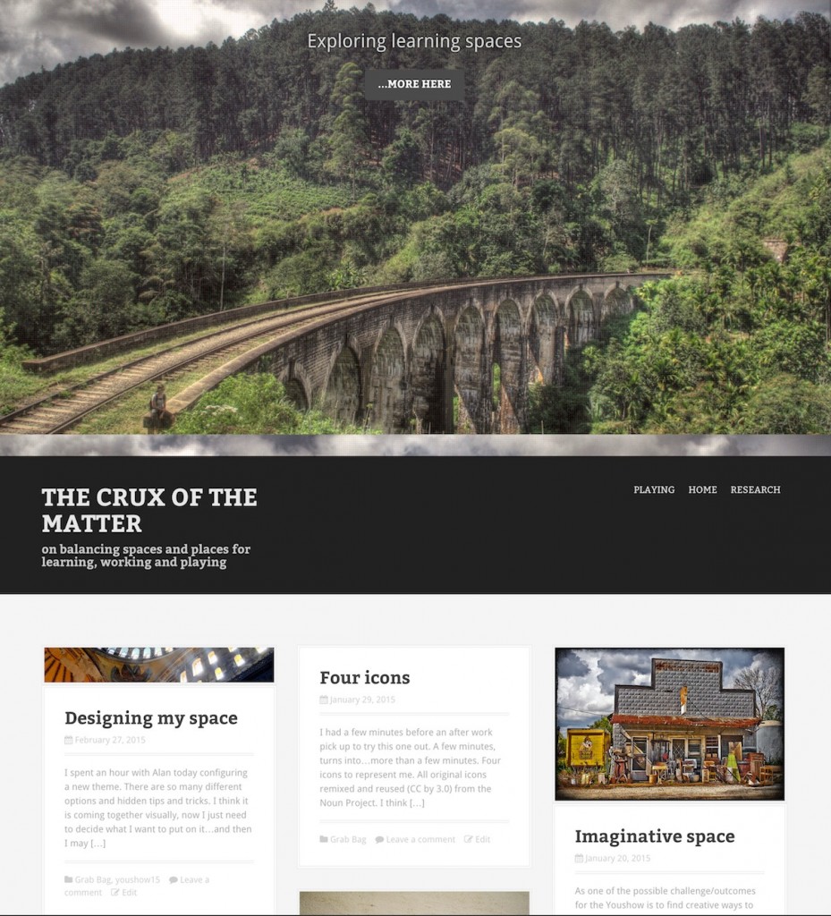
As she described what she wanted, it really reminded me of the Moesia Theme I am using on this blog, so we decided to give that a go, and I showed the stops on how that theme is set up via the Customizer area.
Here is how it looks just after the session. It’s just a start:
I started a screen cast recording but QuickTime Player crashed after about 10 minutes; this is what I did save
Follow Michelle’s progress at http://michelle.trubox.ca/
Now the look of the makeover is just one part. I spend time trying to help them think about the structural set up related to the kind of site they want to make.
What I find is that people get really confused about the difference between creating content in WordPress Pages versus Posts. Most seem to think first of Pages, and there is the naming convention since we call most things on the web “pages”. Pages make sense, and then people make a lot of pages, and make incredible nested structures of subpages.
This is useful for content where the order of things matters, and where a structure like a table of contents or and index works best. I use it on the you show in the Units and the Guidebook, and I make use of the Page List plugin to generate automatically index lists or entire site maps.
Denise had started with Pages for each of things that she wrote. Then she made a page that was a table of contents for 3 short stories. And she create manual links to those stories and manually added them to the menu. Single pages- for an About, a Bio, a list of publications, stand alone content works. But when you start making a structure, Pages get cumbersome, and you have no means of organizing like categories and tags. You cannot put a Page in more than one place in a hierarchy.
So I show people how to set up categories to group things, and how if you write things as posts, you can put them in a category (or more than one), and the archive link for that category then serves to generate dynamically everything that has been published in it.
For Denise we set up a generate category for Writing, and then subcategories for what she knows of now as the topics of her writing, like “Poems” or “Cats” or “Research”. The thing about subcategories is that anything she publishes in the “Cats” category shows up as well in the more general “Writing” category.
Michelle had a different need. She too started writing a bunch of pages, and hanging them off of the menu. She wants to write about different facets of her instructional design work, like “Learning Design” and maybe “Assessment”. Then she wanted to add examples, and things she does in these areas as she goes.
My suggestion was to write a general static Page about the topic, like she has done for Learning Design. Then as she has content to add that supports it, do them as posts in a Learning Design Category. We can add to her sidebar a widget (using Flexible Posts Widget plugin) that lists the most recent posts in that category. And with JetPack plugin, we can use its visibility module to make it so that widget only shows up on that one page.
There is a lot people can do beyond the Post – Post – Post default set up of blogs.
But there’s a lot to grapple with:
- The differences between posts and pages.
- Most themes do not show off all their features when you preview them. And finding where to activate or set them up us wading between the Customizer and some gargantuan theme options panel. Or the theme is set up where it requires certain pages set up with special template settings. Bottom line, the theme preview often does not show off all of its features.
- Menus are confusing at first because by default they just appear. It’s easy to show people how to set them up, but on an intuitive level, its a step and a half.
- Widgets get baffling and plugins seem like they are from outer space.
- Sure WordPress.com is drop dead easy to set up, its free, and then you want to do a simple thing like change the color of a font or background, or enter some custom CSS and BAM! It’s upsell time. Upsell here, Upsell there.
I’m hoping these bursts of one hour coaching can nudge people up the slope of blog skills. This stuff takes time and practice.
But after a makeover, they can feel so good about their own blog self.
One can hope.
