The last semi-official act of my fellowship was a presentation made with Brian Lamb for BCCampus Open Education Week. Also billed as a TIE talk, it was hosted and live streamed at the University of Victoria (waiting on the video archive). Our title was:
The Open Web: (a) Lost (b) Reclaimed (c) Co-claimed (d) All of the above
And yes, we presented from a WordPress site. This post is not about the talk (that one is pending the video link), but just to review how it was put together.
I specifically wanted to do it without major theme hacking, all was done on the TRUbox site with a free WordPress theme — Intergalatic (available in the theme repository). The theme uses nice big images, and is clean, responsive, et al.
The construct for the “slides” is that each is a post. The front of the site is set to be a static page featuring a “big button” that takes a viewer to the first “slide” (Alan what’s with all the “quotes”?).
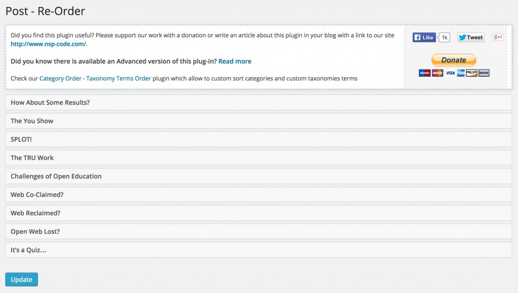
Typically I might have just monkeyed with the post/slide published dates to get the order I wanted, but I was curious to try a nifty plugin Post Types Order, that lets override the normal post order to any arbitrary one- this is done via an Ajax-scented drag interface:
Wait a minute- one astute reader might say, that’s the reverse order of the presentation, and is in essence, the natural order the posts were made (We created them in the order they appear).
Stay tuned.
To customize some of the display, again, instead of editing theme templates, I did all the over-rides with custom CSS. I have the Simple Custom CSS plugin networked enabled in TRUbox since not all themes provide this feature.
Most of the changes are in the footer- this is what the theme provides by default:

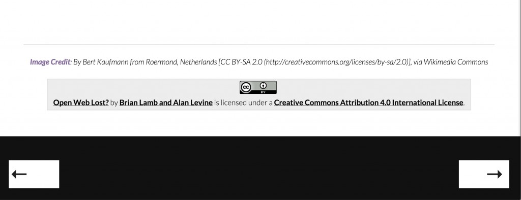
I really do not want to show the author information or the footer credits in the bottom. And I wanted the navigation buttons not to say “Previous Post” and “Next Post”. What I was able to do is make the footer like:
This is the Custom CSS added to make the magic:
/* header stuff */

.site-description { font-size: 1.5em; font-weight: 900; color: rgb(165, 6, 18);}

.entry-content {width:90%;}
/* hide stuff in footer */
.post .entry-meta, .author-avatar, .author-bio, .entry-footer, footer#colophon {display:none;}
/* Make those arrows really big */
span.meta-nav { color: #222; font-size: 500%;}
/* Make the button text white and really small */
.post-navigation .nav-previous a, .post-navigation .nav-next a {font-size: xx-small; color: #fff; width:120px; padding:0}
The power tool in custom CSS is {display:none;} for hiding things.
And thus the reason for setting the post/slide order in reverse is that… the standard order of them is reverse chronological, so to make the bottom right button go to the “next” slide, you really have to go back in order.
I know, this makes the head spin, but reversing the order of the posts works because the way navigation links works is in reverse of that order. Double reverse.
I was pretty stoked with how this turned out. Unlike Powerpoint slides, or even stuff hoisted on services like Slideshare, all you get are pictures of slides, and it’s not even clear these days if you get speaker notes.
In our “SlidePress” we give you know only the Front Stage of slides, but in each we have the backstage notes and references, and can share even more than were were able to do in the talk. It’s all on the web, in our site (not on some third party site that might vanish).
Yes, your blog can be revved up to be a powerful presentation site. Get with the time. i bet your Grandpa used Powerpoint in the 1980s. This is 2015. Get on the web. Present from it.
Later incarnations:
- SPLOTS and Darkweb Plots (Brian Lamb and me, Open Education 2015)
- Welcome to the Agora (Tannis Morgan, Brian Lamb, Terri Bateman, and me, Open Education 2015)
- Opening Up TRU (Brian Lamb, Workshop series)
- TRU Learning Spaces (Brian Lamb)


