“What’s the best theme for my WordPress site?”
Is there a equivalent to the “Best Camera is the one in your hand” assertion? Probably not.
In our work on The You Show open seminar and providing sites for TRU staff and faculty on our sandbox site I’ve been trying to think about ways to help in this decision.
There’s over 3000 free themes offered by WordPress and maybe millions more depending how you parse the google results.
When “shopping” for a theme for most people what they see there in a preview / demo is the end point. They are looking for something that will provide them the design and options to do everything they want their site to do.
For sites I develop, I am looking differently at themes- they are just the starting point since nearly every site I design I end up changing the underlying files, adding my own templates, hacking away at the code. I am looking less at how it looks, and more at the way it structurally organizes information, or what functionality it provides.
That of course is what I never would expect of any other rational person who just wants to make a web site.
My first major WordPress theme hack was for an NMC site back in 2008. The structure of themes then was almost primitive looking back. The theme directory may have had less than 20 files. I have seen modern WordPress themes that include 100s of files.
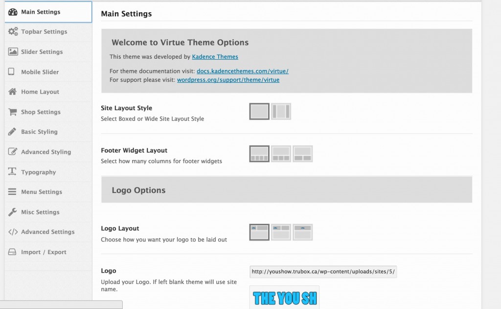
New themes vary wildly in terms of what you get from the inside to configure things. Many have multi-tabbed control panels with gobs of things to modify; this is for Virtue, a theme I am using for the You Show site. You find this under the Appearance menu in the dash board.
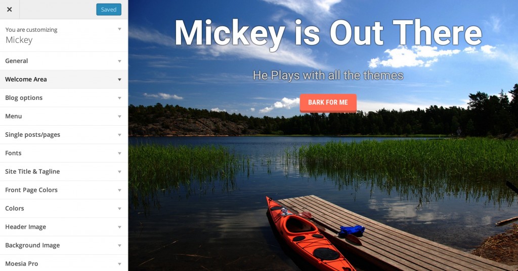
Others put the interface into the WordPress Customizer (which is nifty because you see previews of the changes as you try them out), as in the Moesia Free theme
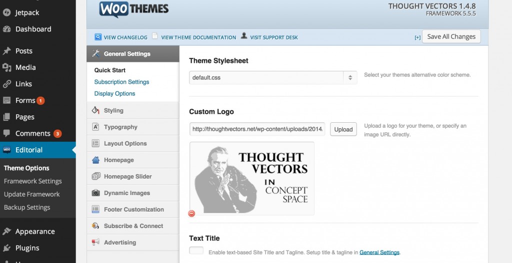
Many premium themes, like Woo for example, add themselves as entire sets of Dashboard menu options (this is for the Editorial theme we used on Thought Vectors in Concept Space)
A lot of themes want you to install extra Page Builder plugins, or Types and Views plugins to add capabilities for things like portfolio content. Or there are these new kind of Build Your Own themes where we can move stuff around, and create almost any layout. With great flexibility comes some (to much) complexity of configuration.
And for any theme that do things beyond the “regular blog” look of a vertical stacking of posts, and pages with sidebars, the preview you see in WordPress will not really match what they theme can do, because they rely on either these custom settings or having content beyond one Hello World post. Some theme sellers allow you to import test content (Woo does this and it can be used in any theme) so you can see a site with more than that stellar default awesome Hello World post.
And then there are featured images. Nice looking themes have front page layouts with images that represent posts, and will thus require / make use of having featured images defined for your posts. Some themes will make the first image you add to a post the featured image if not defined (plugins can add this feature). Some themes, not all, will let you designate a default image. One theme I struggled with required a plugin that set up multiple featured images (one for the post, one for the header banner slider thingie).
So if your posts mostly lack images, and featured images, well the first cut at a graphic driven theme that relies on featured images, amy leaving you saying, “W T F?” (Wheres The Fruit?)
My suggestion when theme shopping is to look for a link to a theme preview site, and to look carefully at ways different kinds of content is shown. Look beyond the front page view in a demo. I see a lot of themes that have gorgeous front landings, and the single post page is the same old header, post on one side, sidebar on the other.
These days I skip themes that are not designed for Responsive layout, which means that content readjusts and resizes based on the size of the screen. Some theme previews offer multiple views so you can see it, but you can also just squeeze the width of your browser to see how / if a theme responds well.
The more you dig in, the more you find to consider. And I have not even gotten to the part where you find that most themes do not responsively deal with embedded videos (“there is a plugin for that“).
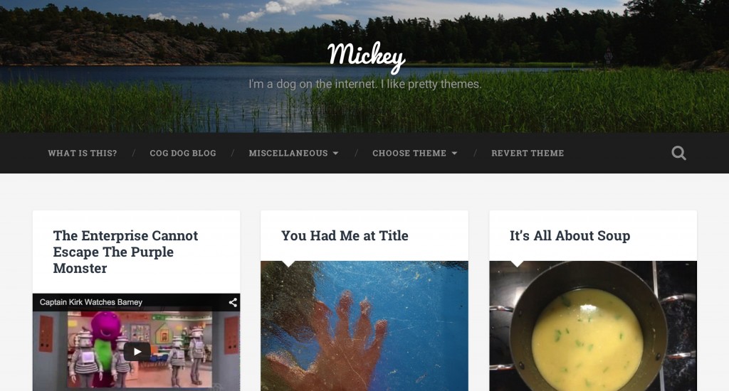
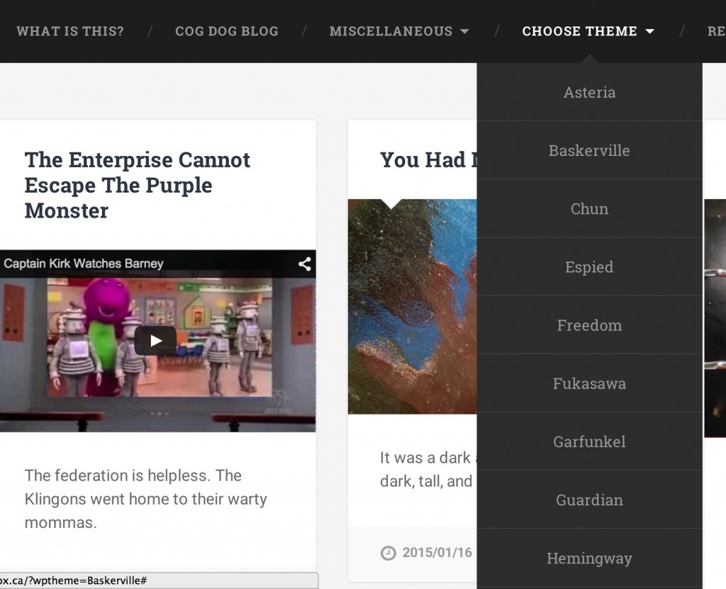
What I am trying on the TRUbox site is to have a demo site that allows a visitor to experiment with something that has a batch of content and presets in the demo themes — (it’s named of course of one of my past dogs)
When I link it’s URL here, you should (if you read URLs) notice something extra:
http://mickey.trubox.ca/?wptheme=Baskerville
That’s right, I am specifying what theme to use on a public display. I am using the WordPress Theme Switcher Reloaded plugin. The plugin gives you a widget that auto lists all themes on a site as a menu; I found though on a multi-site it was listing disabled themes, and some of the special child themes I use for sites that are not really useful to see.
But what’s cool is I can generate a theme switch option via URL, and thus, I have put the theme options under a menu:
So you can see the site in the theme I like but also:
- Chun more of a bloggy look
- Asteria Lite and Guardian where you can make more like a one page landing site
- Fukasawa, Garfunkle give flexible grid display of posts, or more stylish like Marla
- Moesia (the theme I am using on this site), lets you set up a big welcome screen.
It’s not quite perfect, but helps me do demos. If you set a header image on one theme, it may not work on another. Some of the themes seem to eat the menus. Others need more configuration.
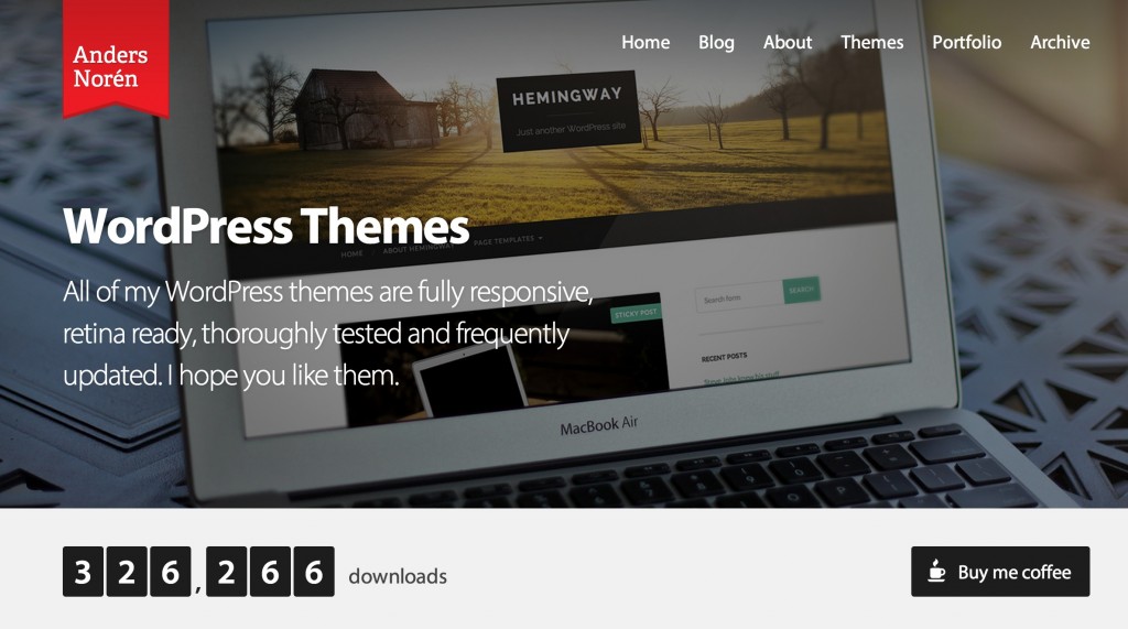
Which brings me to Anders Norén, a Swedish students, web designer, and coffee appreciator, who also provides some amazing, elegant, responsive, and un-bloated WordPress themes. Most of are free and in the wordpress themes collection:
What is lovely about these themes, beyond their looks, are that they are not crazy complex, they lack giant configuration options screens, and for me, as a theme hacker, very amenable to child theming (do not get me started how many theme developers do not know the difference between get_template_directory() and get_stylesheet_directory()).
I first came across the Radcliffe theme when building the TRU Writer. That’s on our box. But then I found Baskerville (primary theme on Mickey) and Fukasawa (which I am using on Image Pool).
These themes are again light weight (no options panel at all), responsive, and very amenable to the kind of site building I do.
In the end… there are more than a few tons of considerations when trying to find a theme. At least the positive thing is that you never lose content. But you might have to recast menus or widgets. If you go with a theme that relies on content in a social custom post type (Portfolio, Skills, etc), those are likely not counted for in another theme.
And some themes have so much to configure, it’s like another operating system. It’s also a challenge to support; when having to help someone with a theme issue, I literally can do best if I can jump in and see where things are stashed.
And you know what? What matter’s most is that you like your theme. Once you find it. And set it up. And ….
