![Lewis Hine [Public domain], via Wikimedia Commons](https://cogdog.trubox.ca/wp-content/uploads/sites/15/2015/03/shaper-1024x750.jpg)
Coming into my last week here at TRU I am hoping to get my portfolio site into shape to represent the four months here of my fellowship.
I am very pleased with the capabilities of this Moesia Lite theme (a free one in WordPress), and it was one I recommended for Michelle and it looks like Christina Hendricks is checking it out too:
@cogdog I like Moesia theme, but the scrolling is too fast (I keep going past what I want). Possible to change that easily?
— Christina Hendricks (@clhendricksbc) March 7, 2015
I like the ability to have the top welcome screen, and I have it set to appear only on the front (not sure I want my face looming over the site that much). The images can be set to be randomized (I think I have 6 or 7).
Moesia has pretty good documentation and a better demo than you can see on WordPress.com. I did not enable all of the vertical one page stackable things it can do on the front (adding a slot for “Services” “Clients”, “Team”, “Testimonials” that is the norm it seems for business sites)- this involved creating a raft of custom post types.
But I did find buried in the documentation a few extra extensions I added, mainly widgets. I don’t like having all these iddy biddy plugins and am curious why they are not baked in the theme, but oh well. So I have an extra extra widget with a bit of context below the big image header (where it says “Portfolio for a TRU Open Learning Fellowship”)
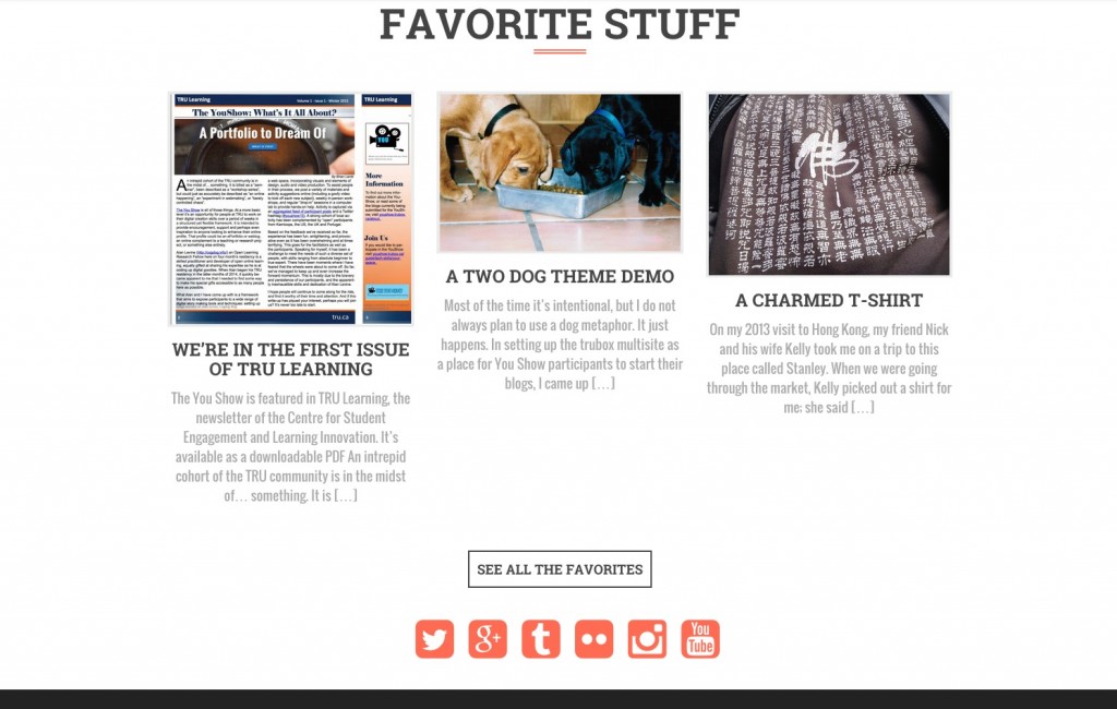
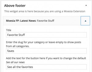
and another widget area at the bottom where I put the Moesia Social widget as well as another one that allows me to put 3 recent posts from my “Favorites” category
My ultimate plan is to shift the front to use a static page that will have some callouts for the key areas, maybe using the Moesia Masonry Extension.
But the real thing I am coming to realize is an ongoing grand challenge is how to categorize content. We urged You Show participants in the very first unit to try and brainstorm possible categories, but this is hard to do if you have no experience creating a site like this.
Thus categorizing ends up being something that evolves as you add more to the site (unless everything remains “Uncategorized”), which I know from my main blog, ends up being a bit chaotic and uneven. And having to back categorize gets tedious.
I do think there is a middle ground, to be a little adhoc until maybe you have 50, 6o (?) posts, and then seeing if there is a more meaning full bins to organize posts into. My suggestion is fewer top level categories are better, make them comparable in scope but somewhat broad.
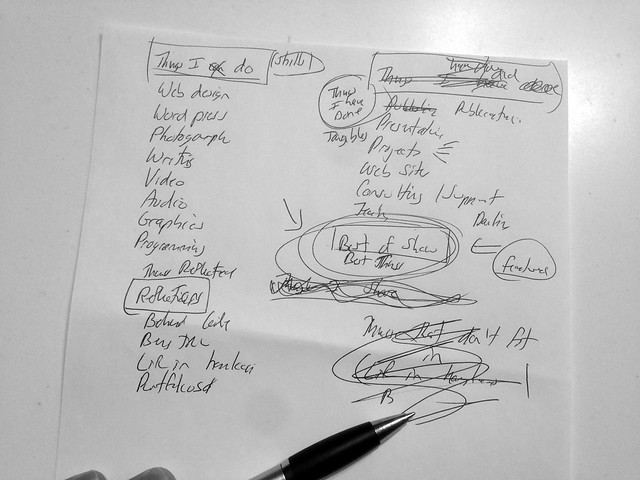
I sat down last week with a blank paper and a pen to rethink my own on this site:

And came up with four top categories, with a “stuff-y” flavor:
- Stuff I Can Do — skills in technology, media development, writing, and also one I like “Explaining”.
- Stuff I Have Done — tangibles that would show those skills; e.g. projects, web sites, publications, presentations
- Stuff Reflected — the meta writing and narrating, plus other activities that have happened while here not strictly related to work.
- Favorite Stuff – my own picks for favorite posts or the items I want to foreshadow.
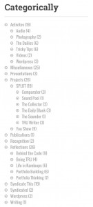
Under each are more sub categories, and most posts end up in more than one place. On interior parts of the site, this appears in a sidebar
There is another category Syndicate This for posts I republish on my main blog via RSS Feeds. This indicates something else too, the posts I felt worth sharing more widely.
Like this one!
I have the top level ones on the menu, and am considering whether to add all the sub categories to it. Right now, I am leaning away.
This seems to be ab ongoing process of refining, so it’s never quite “done.” I keep changing, so thus my portfolio should. And you probably cannot do that much changing in a centralized portfolio tool.
Plus each iteration of considering the categorization is a self-reflective exercise.


