creative commons licensed ( BY-SA ) flickr photo shared by cogdogblog
I knew my photos from the Gopher Hole Museum would come in handy one day! Blame D’Arcy Norman, he sent me there.
Advanced warning of a long scrolling post with lots of screenshots and smattering of technobabble.
One of the project-ish things on my table here at TRU is an idea hatched with Brian Lamb to address the issues of using resources hosted on non Canadian web sites that require user data. After a horrid Academia.edu experiences yesterday of having to practically donate a spleen to download a single paper, the perverse nature of so many sites that ask for a login is getting tiring.
So the idea is to develop some small tools teachers, learners could use that do not require accounts.
Brian is completely responsible for the name.
Disappointed that @cogdog hates my proposed acronym SPLOT for a project. Obviously snazzy marketing ain't my thing. I wonder what is…
— Brian Lamb (@brlamb) October 28, 2014
Hate is such a strong word. Maybe I responded with mockery. Or maybe the idea and the “LO” is too much of a Learning Object flashback. But here we go, we have a domain and a site for Smallest Possible Learning Online Tools (SPLOT, http://splot.ca). It’s made as a splash landing on a multisite, where new splots will be separate ones
The first one I am experimenting with, is itself, perhaps not exactly a workable tool. The tool is not necessarily the end goal, but to play out the concept. At least that’s how I console myself. Each time I scrape at working on it, I hit another layer of challenge.
But my take away with this first one is a nifty way to give advanced content creation capability to site visitors, using a WordPress platform, without giving them wordpress accounts. IN fact, they secretly use an account without even knowing it.
I have seen a thingy on some web sites, and Tom Woodward had played with it too, that provides a way to compare two images that are overlapping with a little slider. I found an original code library, the jQuery Before/After Plugin.
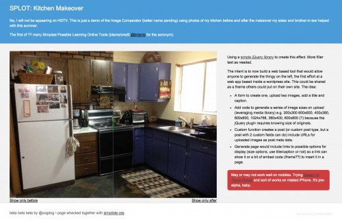
It’s not hard to do… if you have some basic web and HTML chops. The download includes the needed Javascript libary, you find two images of equal dimensions, write the HTML code for them, put the jQuery scripts in the <head>…</head> of the file. I did a prototype in static HTML to understand it, using photos of the before and after of my kitchen remodel this past summer:
But already I have lost most people once I start talking about editing HTML. It would be fairly easy to make a Mozilla Thimble of this (I still might).
And as Tom pointed out in twitter, there is actually a slick implementation of this as JuxtaposeJS, probably better than what I could make.
But it’s the concept not the tool.
Why do it WordPress? It could probably munge it out of PHP and mySQL. One reason was the WordPress media library. I had already figured out for the ds106 Assignment Bank Theme how to create a media uploader just like in the blog editor. The advantage here is that I could predefine a number of possible dimensions people might use (landscape, portrait, square, and in those small, medium and large). When media us uploaded to the library, it can downsize to all those sizes automatically.
Each new “Comparator” (the awful name I did come up with) would be published as a single “post” with a custom template to add the extra code that makes it work. A custom page with a form in its template is used as the tool to make one.
Plus, if someone had uploaded images previously, or the site is used by a group of collaborators, the existing media could be shared.
So in a few rounds of tinkering, I managed to get the media uploading working, and even generating a somewhat working version. But the first problem is that when not logged in as a site user, as a visitor, I could see the uploader, but nothing could be uploaded (permissions).
As it turns out, you have to be logged in as a user with at least Authoring privileges to upload media. My first effort was then to create a generic authoring account, and maybe we would have to share the login. The user needs no access to the dashboard, they just need to be logged in as this user.
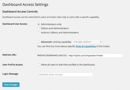
I set up the Remove Dashboard Access Plugin which is designed to do what it says- non-admin users can never see the dashboard; once they login, they are redirected to a URL you can enter as an option:
I also found a nice bit of code to hide the admin tool bar, so once said user is logged into the site, there is no indication that they have an account.
add_action('after_setup_theme', 'remove_admin_bar');
function remove_admin_bar() {

	if (!current_user_can('administrator') && !is_admin()) {

	  show_admin_bar(false);

	}
}
To reduce the login screen, I found some more code for how to change the WP logo, change its link, and hide the links for resetting the username and going back to the blog.
add_action( 'login_enqueue_scripts', 'my_login_logo' );
function my_login_logo() { ?>
        body.login div#login h1 a {

            background-image: url(/images/site-login-logo.png);

            padding-bottom: 30px;

        }

	#backtoblog {display:none;}

	#nav {display:none;}
<?php }
// Make logo link points to blog, not WordPress.org Change Dat

add_filter( 'login_headerurl', 'login_link' );
function login_link( $url ) {

	return get_bloginfo( 'url' );

}
But still… a login screen. Giving out a username/password… that is not yet Smallest Possible. On a whim I searched to see if there are ways to create a link to automatically login a user, and found the answer. The beauty here is the username/password are not part of the link, its buried in your functions.php — and you pick the link to send them after the login is done:
// Auto Login

// create a link that can automatically log in as a specific user, bypass login screen

// -- h/t  http://www.wpexplorer.com/automatic-wordpress-login-php/
add_action( 'after_setup_theme', 'comparator_autologin' );
function comparator_autologin() {

	// URL Paramter to check for to trigger login

	if ($_GET['autologin'] == 'splot') {
		// ACCOUNT USERNAME TO LOGIN TO

		$creds['user_login'] = 'XXXXXXXXXX';
		// ACCOUNT PASSWORD TO USE

		$creds['user_password'] = '••••••••••••';
		$creds['remember'] = true;

		$autologin_user = wp_signon( $creds, false );
		if ( !is_wp_error($autologin_user) )

			header('Location:/comparator/make'); // LOCATION TO REDIRECT TO

	}

}
And that completes me. I now have a way to automatically, invisibly log in a user to an account that has no accessible privileges, just via a link like http://splot.ca/comparator/wp-login.php?autologin=splot
This means on the page that I made to create the form for making a Comparator, I have a logic check that does not display the form until the login link has been clicked, and if there is not an active login, just presents and activate link (the get_bloginfo function avoids a hard coded URL meaning I cold use same login on another site)
Before you start please

<a href="/wp-login.php?autologin=splot">activate lasers

?>
But look at me, all his code and details, and no demo. I forgot my own law. How does this thing work?
This is a walkthrough of using the Comparator tool to create http://splot.ca/comparator/made/36/
For material, I found a collection of these comparisons at Elearning Examples and am using one that shows a final painting and its original sketch– from Charles Kaufman’s Sketch vs the Finished Painting. I split the image into 2 exact sized images as “before” (the sketch) and “after” (the final painting).
It works best if the images are much larger than the intended use size, so WordPress can downsize into multiple versions.
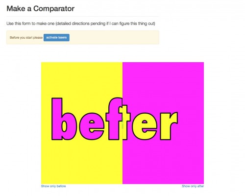
Using a browser where I am not logged in, I go directly to the Make place. It has a default one made there, that I can play with, but first I have to activate the tool (“activate lasers”)
Once that is done (technically I am logged into the WordPress side, but cannot get to the dashboard) I can then use the form below to upload my own images
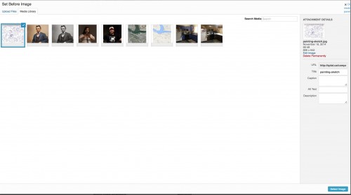
The two buttons provide access to the media library where I can define each image (either upload or selecting an existing image). I love being able to have a drag and drop interface for this, thanks WordPress!
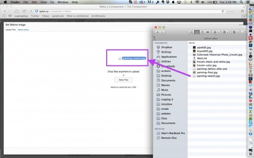
And then I can see my uploaded image in the media library (along with previously uploaded ones), and I then set it as my “Before” image
Once this is selected, my preview is dynamically updated to indicate the first image is set
I repeat with the other button to upload and set the “after” image, or the final painting
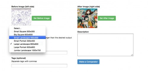
The slider is a fully functioning one, so I can play with it to see how it works. As another dynamic feature, I can choose some different orientations, that again, are jQuery dynamically changed in the form. The default size is 800×600 but I can set it for a smaller version, say half those dimensions or 400×300
And just on a menu selection, the whole thing changes to that size. And still works. I am pretty “chuffed” at this achievement.
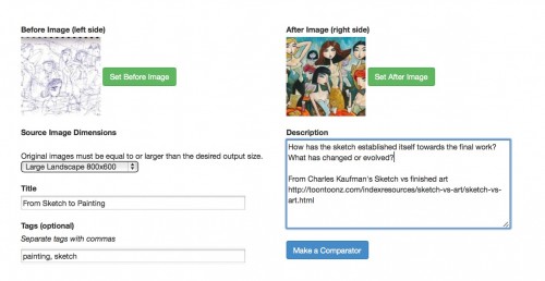
Now that the images and sizes are set, I can add extra info like a title, optional tags, and a description that will be used as a caption
All of this gets saved as a post on the click of the Make Comparator button. Behind the scenes, I am adding three pieces of post meta data as custom fields:
- The URL for the original uploaded “before” image.
- The URL for the original uploaded “after” image.
- The code name for the size of the Comparator to make (e.g. “small-landscape”, “big-square”)
On the template that displays the thing I can then construct the whole thing knowing this inforation; and array for the sizes of each available output size can be used to generate the proper URL for the different sized image. For example, the “after” image URL is http://splot.ca/comparator/files/2014/11/painting-final.jpg but to use the “large-landscape” size (800×600) I need to create the URL to look like http://splot.ca/comparator/files/2014/11/painting-final-800×600.jpg
There’s a bit more code to add the extra Javascript libraries needed to give it functionality.
So what we have at the end is a Comparator published at http://splot.ca/comparator/made/36/
This is merely an entry for it. I have a link that someone could then use to send from any web site to use the thing http://splot.ca/comparator/made/36/?show=1 — the extra “?show=1” tells it to not show the wordpress menus and all of the extraneous link info.
Ideally one would want to embed this in a site. This gets more complicated for all of the JavaScript code it needs. I have a working version of embed code that will work in a stand alone HTML page (I am getting some jQuery conflicts in WordPress). I have set this up so the scripts and the media for the slider controls are loaded from Google Drive.
Here is a previously made one sitting in a static HTML page on my web server I have a slider between the map and satellite view of downtown Kamloops
Just for fun, I made an HTML version for the sketch/painting one I walked through above. I uploaded that to my google drive. There is a nifty way you can use that content. The URL for my page there is
https://drive.google.com/file/d/0B3J3hv1B8VO1dkMzLUJuZGFudlU/view?usp=sharing
if I just copy the ID string after “/d/” and before “/view?” and if the document is set to be public viewable, I can use this as a direct URL
https://googledrive.com/host/0B3J3hv1B8VO1dkMzLUJuZGFudlU so my Comparator is running from Google Drive
That alone is a nifty trick (its how I have my Javascript libraries loaded there, so they don’t put demand on my web server).
Sooo…. Is anyone here reading this? I really wanted to document this out.
As a tool, I am not sure how viable this is. I’d like to see some people think of ways they might use it. I should add a feature that allows you to set the default starting position (it’s possible).
If you want to look around and have a go, visit http://splot.ca/comparator or try a hand at making one at http://splot.ca/comparator/make (it does need some instructions; the critical part is finding two images of the same dimensions)
But its not about the tool, it’s a play for us to dream of some ways of making tools that are lightweight and get away from so much user data gathering.
And thus, I am splotting.

