
Of all the creative assignments from DS106 (of which there are more than 730, that is so un-massive) maybe my favorites are the re-edits of movie posters. If any institution ever wanted a class taught in remixing old movie posters… well contact me, ok?
I can talk about the many layers of these creative tasks, from the framing of the idea, to the choice of the original, the design aesthetic, matching typography, masking the backgrounds, and developing a coherent message at all levels.
But enough rationale, it is just damn fun.
After some twitter banter a few days ago with @amyburvall and @wickeddecent about remix, and Amy shared some resources in her Google+ space, this response I saw this morning called to me
@amyburvall @cogdog flippin G+ . . . I like it & have to belong to everything w both my school & prof G+ identities else #logingnarlies
— WickedDecentLearning (@WickedDecent) November 8, 2014
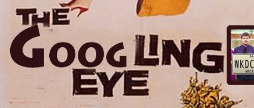
The #logingnarlies difficulties with Google+ yelled MAKE A MASHUP POSTER, which was the one you see above, about an hour’s worth of Photoshoppery. I am liking this one a whole lot, because it really puts into perspective what Google is likely up to. They are watching everything. Non-believer? Read James Somers incredible post on how he hacked the innards of Google docs to create a keystroke by keystroke edit history. Think of what they might do with that kind of data. Big. Juicy. Data.
If I was every on task, I would take screenshots as I went to document the process, but here is the best I can do from memory.
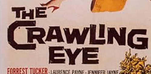
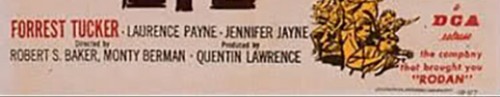
So it starts with looking for the source, by a google images search on “movie poster sci fi” — I usually use “vintage” to get a set of results with old posters, but hey, I got there by scrolling down a bit. I saw even one I had used before, but the one for “The Crawling Eye” lept out at me

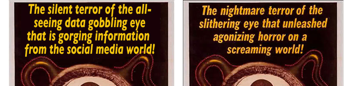
Here’s the original. There are quite a few reasons that make this a candidate. First of all, the top text, and the rest of the poster has a pretty solid background, this makes it easier to wipe out the original content, and replace it. Things are harder where there is a complicate background behind. The “eye” in the middle lends itself to putting a google logo, but most of all, the whole premise of an evil “eye” fits the theme of what I might be saying about Google.
Picking the original to work from is perhaps the most crucial step.

It comes from a post of 1950s and 1960s British Sci Fi movie postes at blog called “Friday Night Boys”. Just the blog tag line makes me smile:
The Friday Boys are a disparate group of six men spread across Tyneside who meet once a week – ‘always on a Friday’ – to talk about the arts, raise a glass to recently departed heroes and villains and, at the evening’s end, down a whisky or two. The FBs have only one golden rule – talk of the working week is strictly off-limit.
I like that kind of gathering. Anyhow, how can you not go for a movie summarized as
A series of decapitations on a Swiss mountainside appear to be connected to a mysterious radioactive cloud.
Now I have to admit something here. For all my advocating of using open licensed materials, I am deliberately breaking the rules. This is without a doubt, if you read the law, a violation of copyright. I will stand on wobbly ground of parody and zero commercial intent. But more than that, I think while we ought to advocate for attribution and open licensed “stuff” there comes a point to protest the ridiculous extent and reach of copyright law. If there is no space for a farcical remake of an old movie poster from a bad movie… well the law is just f******.

On importing the original into Photoshop, my first step always is to make a duplicate layer of the original, because one is going to be edited as the base layer, but keeping the original, gives me a reference to work against. I toggle the working background on an off to compare an edit to the original.
When changing text of an image, you of course need to try and match the font. If you are doing just a word from a title, then its important to try and either match or get a font that’s really close to the original, that’s where tools like What The Font come in handy.
For the large text here, however, I could see I would change the entire lead text, so it just meant finding a font close enough. In these cases, I start trying to match by typing in a different color,m and making text settings. In this case, I went with Gill Sans Bold (it matched the drops in the “g” but not quite the structure of the “a”):
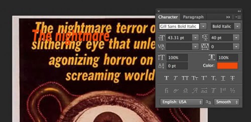
I fiddle with the font size, line spacing, kerning, to get something close. In this case, I even used Edit -> Transform -> Scale (it works on text) to get a close match on the text style. Then I flip back on my editing copy of the original, now it’s time to remove the old text. Given the background is a consistent dark color (select with the Eyedropper tool), it’s easy to do a few rectangular selections and fill to bank out the original text.
I can then type in the next text I want, and from the text editing palette, can even eye dropper the original color to get the matching color. It’s not exact, but for me, Good Enough is good enough:
Next, I want to provide a visual reference to Google+, and that eyeball is where it goes. I ran an image search on “google plus icon” — typically I add “png” to the search because getting a transparent background icon becomes easier to work with. As luck goes, that’s what I found anyhow (from a great source, the Icon Archive), and it was round!
This one was easy to drop into a new layer, and a bit of rescaling made it fit the eye. Dropping the opacity makes it blend in:

On the bottom right side are two areas to work with, a block of text to change, and the square with the picture of a dude in it:

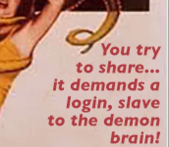
I do a similar text matching scheme, and use the same Gill Sans Bold as the title text, just much smaller, and right justified (and bigger than the original, which was hard to read). When I have the text what I want I hide it so I can clone out the text. The Clone Stamp Tool is perhaps the most important in the arsenal. It is a brush (so you set the size and shape), but the key is that you control click on one area, and use the tool to brush in a copy elsewhere. So the process is to repeatedly set an origin point, and start covering the original content, in this case the red text, with a blank area of the poster background. It need not be perfect, since new text will cover.
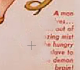
It might take a good 20 stamp and small brushes to clear out the red text. I can then activate and modify as needed the new text, since it’s on its own layer, it becomes easier to modify, because unlike the original, its now detached from the background. Layers are golden.
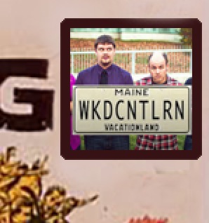
Over that icon of the man, I wanted to put the avatar for @WickedDecent (copied from their twitter profile). There is a bit of a challenge since the original area is rectangular.
No problem. First I go to the edited background, and completely clone brush out the original content.

I can then place the twitter avatar where I want it
![]()
Now I want to put a brown frame around it, like the original. So first I command click on the layer with the twitter avatar, this selects it. I then movie to my working background layer, and go to Select -> Modify -> expand to enlarge the area by 7 pixels
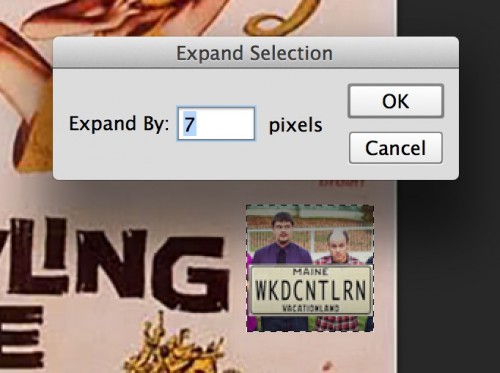
I use the eye dropper tool to select the brown color from elsewhere in the image (the large “Crawling” text), and do a fill- since this is behind the icon, we get a nice frame.
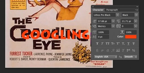
Now it’s time to redo the main title text. This one is tricky since its pretty far from a findable font:
It’s not really a good match, but Lithos Pro Black was ok. I tested it out in red first.
Looking at the original, I realize I can use the original “LING” and just need the opening “GOOG”. So I clone brush out the original “CRAW”, and make the text the same color brown. I try changing the font size of the first “G”
Hmm I can do better. In this case, it makes sense to Rasterize the text layer, so I can work with it like image elements. I then realized, I could copy the original G at the end and put it in the middle. I then used selection tools to raise the opening G, and scale it, and nudge the “O”s up and down to offset them.
For a final touch, I used a small paint brush to speckle in some blemishes to match the original. This is pretty good! Close enough!
You should get a sense of how I go anout doing the bottom credits text; I like to redo as much text as possible, so after some more font matching (Helvetica Neue Condensed for the credits and Bauhas 93 to change the original “DCA” to a “CDB”) I clone brushed out the original, and tweaked the new text to fit. I got lazy and left the director and the producer. Dock me 5 points, willya?
What else should we do? Oh yes, the screaming woman below the title, she needs a new face.

Whose face would work? Hmmm, maybe someone involved in the original discussion in twitter. I grabbed Amy’s icon and dropped it in the document. Normally I would do a selection on the original, feather the edges, and use Edit -> Special -> Paste Inside but I thought I could cheat it this time quickly.
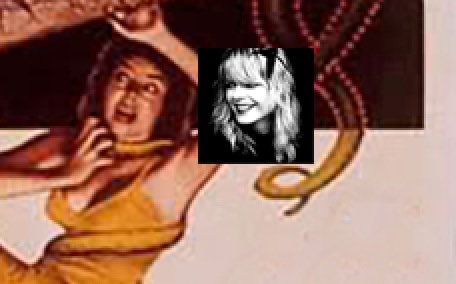
In tis case, I go in with the eraser tool set to a feather edged paint brush, and carefully start to wipe out the black background.
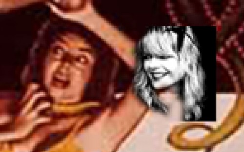
Once done, I move it over the original rotate, and resize to match. I have to erased out a bit at the top so it remains looking like her arm is in front:

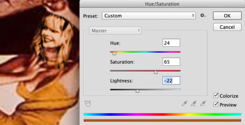
Of course, it looks like a black and white head pasted in. So now we go to Image -> Adjustments -> Hue Saturation. Click the “Colorize” box, and start using the sliders to get a tone that tries to match the original:
Those are most of the steps (as I recall) to make the poster. It’s taken me longer to write this up than it did to make the mashup!
The most important things I have learned in doing this are:
- Picking an original image that has potential to modify, both in what elements it has, and what will make it easier to modify.
- The Clone Brush tool is critical to being able to remove the original content (text, image elements), to make room for new.
- You can spend a lot of time/effort to duplicate original fonts, or just go for “good enough”.
- Manipulating layers, selections, and masks are the keys to the kingdom.
Now about that class in Movie Poster Mashup Making, who wants to host one in the Spring?
And look up in the night sky, you might see the Googling Eye.
UPDATE: Nov 9, 2014 Blimey, I forgot that I meant to provide a download of the Photoshop file if you want to poke among my layers (oh that sounds so wrong). Download googling-eye.zip (PSD file)
Well – I circulated to my students – but I bet they would LOVE a class on this. We run on Wednesday mornings, 09.00-13.00 – when can you come in?! Sandra
I’m busy this Wednesday how’s next week? 😉
Actually that would be great! Where are you based? 🙂
This came out beautifully, and thanks for the play-by-play. So good!
Alan,
Right after gifs comes remastering old movie posters in my Pantheon of Disinterests, but I do love your geeky enthusiasm!
Moi